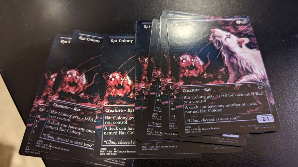
If you’ve ever held a freshly printed proxy and spotted that tiny white sliver on the edge, you’ve met the real boss fight: MTG proxy cutlines and borders. Not the art. Not the text. Not even the back alignment. Just the cold reality that paper gets cut by machines (or by you, at 1:17 a.m., “carefully,” with scissors).
This guide breaks down what cutlines actually mean, when a white border saves you, when full-bleed makes you look like you know what you’re doing, and what sleeves will politely hide for you.
MTG proxy cutlines and borders: the three lines that matter
Most proxy printing problems come from mixing up three different “areas” of a card file:
1) Cutline (trim line)
This is where the card is supposed to be cut. In templates it’s often shown as a line. In production, it’s the target.
2) Bleed
Bleed is the extra image that extends past the cutline. It exists because the cut can shift a little and still needs to hit ink instead of raw white paper. If your background color or artwork stops exactly at the cutline, you’re basically daring the cutter to leave you a white edge. The cutter accepts dares.
3) Safe area (safe zone)
This is the “keep important stuff inside here” zone. Names, mana costs, rules text, set symbols, the tiny collector number you insisted on including. If you put key text outside the safe area, it may get trimmed off when the cut shifts.
A lot of card printers publish template guidance that boils down to: add bleed outside the trim, and keep key elements inside the safe zone. That advice is not a suggestion. It’s physics wearing a name tag.
White border vs full-bleed: choose your failure mode
Let’s talk borders, because borders are where good intentions go to become “close enough.”
Full-bleed (art goes to the edge)
What it looks like: Borderless cards, modern showcase styles, full-art lands, and anything that’s meant to feel “printed-to-the-edge.”
Why people love it:
- When it’s done right, it looks clean and “real.”
- Minor off-center cuts are less obvious if the edge is still inked.
- Works great for borderless frames and modern proxy aesthetics.
How it fails:
- White slivers appear if you didn’t include enough bleed or your background doesn’t extend far enough past the cutline.
- Busy art near the edge can look “cropped weird” if the cut shifts.
- If you’re relying on a perfectly symmetrical frame at the edge, you’re back in border land (see below), just with extra steps.
White border (intentional margin around the front)
What it looks like: Classic MTG frames, old-school white-bordered vibes, or a modern card image placed with a consistent white margin around it.
Why people love it:
- If you’re cutting by hand, borders make trimming way less stressful.
- A border can make slight cropping feel “intentional,” especially if the art is framed and centered.
- If you’re sleeving, a border can visually separate the proxy from the sleeve glare and edge reflections.
How it fails:
- Borders make miscuts obvious. If the cut shifts, your “even” border becomes “thicker on the left because the universe hates you.”
- Thin borders are the worst of both worlds: they show unevenness and don’t hide much.
- If the border is part of the design (a frame line, pinstripe, etc.), the tolerance becomes painfully visible.
Here’s the blunt truth: full-bleed hides small cutting shifts better, but punishes you for skipping bleed.
white borders forgive imperfect bleed, but punish you for imperfect centering.
So pick what you want to be mad about.
What sleeves forgive (and what they definitely do not)
Sleeves are the duct tape of Magic. They fix a lot, but they don’t fix everything.
Sleeves can forgive:
- Tiny edge imperfections. A slight white sliver or a slightly rough cut edge becomes less noticeable once the card is inside a sleeve.
- Minor off-center cropping. Especially if the front design isn’t screaming “symmetry.”
- Back-side ugliness. Opaque sleeves are basically a privacy curtain. If your backs are slightly off-color or you used a “proxy back,” most people won’t see it.
Sleeves do not forgive:
- Text cut off. If your mana cost is missing half a pip, no sleeve is going to gaslight your opponents into believing it’s fine.
- Uneven borders on a clean frame. A classic MTG-style frame with an off-center white border is visible even in a sleeve, because the frame itself is a ruler.
- Crooked cuts. Sleeves hide roughness, not geometry. If the cut is angled, the card will look angled inside the sleeve. It’s like putting on a nice shirt with a crooked tie and hoping nobody has eyes.
A good rule: sleeves hide edges, not mistakes near the edge.
Which is why safe zones exist, and why your card name should not be flirting with the trim line.
If you want the short version: if you’re playing sleeved (most people are), full-bleed is usually safer visually. If you’re cutting at home, or you want a classic framed look, a border can still work, but you need to design for real-world cutting tolerances.
Practical file setup that survives real cutting
You don’t need to become a prepress wizard. You just need to stop trusting that a cutline is a magical force field.
Here’s a practical approach that works whether you’re printing MTG proxies, Netrunner alt-arts, Lorcana test cards, or that Pokemon custom card your friend swears is “just for fun.”
Use a real template (or match a real template’s logic).
Templates exist because printers know cuts can shift. A typical setup is:
- Trim size (the final card size)
- Bleed outside trim
- Safe area inside trim
Extend backgrounds and edge art into the bleed.
If the card has a black edge, the black needs to continue past the cutline. Same for gradients, textures, and full-art frames.
Keep anything important inside the safe area.
Names, mana costs, rules text, loyalty numbers, anything that would cause a judge call if it were missing. Even if you aren’t playing sanctioned events, you still want your card to be readable without a detective’s loupe.
Avoid hairline borders.
If you’re doing a white border, make it comfortably thick. Thin borders highlight tiny shifts and make the card look “off” even when it’s only off by a little.
Export clean.
If your file gets compressed into fuzzy mush, you’re adding a new failure mode you didn’t need. Keep text crisp and avoid repeatedly re-saving as low-quality JPG.
If you want a sanity check before you upload or print: overlay the trim and safe lines on your final file and ask, “If this got cut a little high, would I be embarrassed?” If the answer is yes, move the important stuff inward and extend the background outward.
Common cutline and border problems (and how to fix them)
Problem: White sliver on one edge
Fix: Add more bleed. Extend the background or edge art beyond the cutline.
Problem: Border is uneven (thick left, thin right)
Fix: Make the border thicker, and keep the inner frame farther from the trim. Borders require extra tolerance.
Problem: Card looks “zoomed in” compared to real cards
Fix: Your art is probably being scaled or cropped to fit the template. Re-check your file dimensions and make sure you’re matching the intended trim size.
Problem: Rules text is too close to the edge
Fix: Respect the safe area. Move text inward. Yes, even if it “looks better” closer to the edge. You know what looks worse? Missing text.
Problem: Front and back don’t feel aligned
Fix: Some drift is normal across runs. If it’s extreme, your files may be mismatched in size or positioning. Use the same template logic for both sides.
Problem: Looks fine unsleeved, looks worse sleeved
Fix: Sleeves add glare and edge framing. High-contrast borders and super-thin lines near the edge get more noticeable. Soften the design near the perimeter or give it more breathing room.
And if you’re wondering why your perfectly centered design still came out slightly off: welcome to printing. The cut can shift a bit. That’s why the template lines exist in the first place.
The quick recommendation
If you’re choosing between white border and full-bleed for your next batch, here’s the practical call:
- Most players printing sleeved decks: go full-bleed, use proper bleed, and keep key info well inside the safe area.
- Home printing and cutting: a white border is friendlier, but make it thick enough that small shifts don’t scream at you.
- Clean framed MTG look: white border works, but design like you expect the cut to drift, because it might.
- Borderless showcase vibe: full-bleed all day, just don’t skimp on bleed.
Either way, treat MTG proxy cutlines and borders like a system, not a vibe. The vibe is how you end up with a white sliver that haunts you through double-sleeves.
